
Probit Plots in Python

Probit plots are a commonly used data visualization tool in the oil and gas industry for analyzing probability distributions. They are useful for assessing uncertainty and risk during play exploration, acreage evaluation, development planning, and reserves estimation.
In this post I’ll cover what a probit plot is and how to make one using your own data and Python. We’ll use the Python library mpl-probscale. Many of the figures and explanations below are inspired by the mpl-probscale documentation, so be sure to check that out for more information. Mpl-probscale provides enhancements to matplotlib, a Python plotting library. This post isn’t meant to be a matplotlib tutorial; for that, I recommend reading through this post and some of the other resources on my resources page.
What is a Probit Plot?
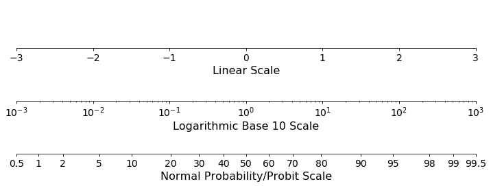
A probit plot is a cumulative frequency plot where the y-axis, or cumulative frequency axis, is transformed by the normal distribution (aka the “Probit Function”). The concept is similar to the more familiar logarithmic scale. Just like when plotting data on a logarithmic scale where the spacing between the axis ticks is determined by the log() function, the spacing between the ticks on a probit scale is determined by the probit function. This means that data points that fall near the tails of the distribution are spaced further apart than the data points in the middle. Notice, for example, on the probit scale in the figure below that the distance between the 0.5 and 1.0 ticks is about the same as the distance between the 40 and 50 ticks.
Cumulative probability plots make it easy to determine the probability that data drawn from the visualized distribution will fall above or below a certain value or fall within a certain range. Visualizing cumulative frequency data on a probit scale has all the benefits of using cumulative frequency plots on linear scales but with a few extra features. When data drawn from a standard normal distribution is plotted on a probit axis against a linear axis it will plot along a straight line. When data drawn from a lognormal distribution is plotted on a probit axis against a logarithmic axis it will also fall along a straight line. Because normal and lognormal distributions are commonly found in nature and are relatively simple distributions to model, this makes probit plots useful tools for data visualization.
In the figure below, you can see the difference in shape of the same data, drawn from a standard normal distribution, plotted on a linear cumulative probability scale versus a probit cumulative probability scale.

As demonstrated in the figure, visualizing data on a probit plot allows you to quickly assess exceedance or non-exceedance probabilities and to assess how well your data sample fits the normal or lognormal distribution. Also, because the data values are stretched out at the tails, probit plots make it easier to understand the behavior of the distribution at the low and high values of exceedance probabilities.
How to Make a Probit Plot Using Python
To make the probit plot with Python, we will use the python packages mpl-probscale and seaborn. Probscale provides the extremely convenient function probscale.probplot for making probit plots.
We’ll start by importing the packages we need and using scipy.stats to create a random sample of data from the normal distribution to plot.
import probscale
import seaborn as sns

# Generate 20 random numbers from the normal distribution
from scipy.stats import norm
data = norm.rvs(size=20)
Generating a basic probit plot is as easy as passing the data to the probscale function and telling it which axis the probit scale should go on. The seaborn function sns.despine() cleans up the plot and makes it look nicer.
probscale.probplot(data, probax='y')
sns.despine()

A more complete plot
Now that we have a basic probit plot, let’s load some sample data and add some features to the plot to make it more complete. We will use the numpy.loadtxt() function to load some synthetic data from text files. For the sake of this example, the data represents estimated ultimate recovery (EUR) values in thousand barrels of oil (MBO) for 40 wells from two plays. Twenty are from Play A, and twenty are from Play B. We will plot both samples on the same probit plot to compare their distributions.
The code to make the plot is included below. We will need to import numpy to allow us access the array datatype and to read the data from the files. We will also need to import matplotlib.pyplot to give us more control over the details of the plot. The probscale.probplot function is the same as before, but with a few more arguments. To see an explanation of the arguments you can pass to the probplot function, check the documentation.
Depending on which convention you choose, you may want to flip the labels on the y-axis ticks. This will depend on how you think of the P10 and P90 probabilities. By default, probscale considers the P10 to represent the data value that you have a 10 percent chance of not exceeding and the P90 to be the data value that you have a 90 percent chance of not exceeding. In other words, 10 percent of your data is less than or equal to the P10, and 90 percent of your data is less than or equal to the P90. Many people (and companies) take the opposite convention: the P10 should represent the value that you have a 10 percent chance of meeting or exceeding. With this perspective, 10 percent of your data is greater than or equal to the P10. If you follow the second convention, you will need to reverse the ticks with the line:
ax.set_yticklabels(100 - ax.get_yticks())
If you follow the first convention, leave this line out of your code.
The rest of the code deals with the aesthetics of the plot: adding reference lines and labels for the P10, P50, and P90, labeling the axes, creating a plot title, and setting up the legend.
import probscale
import seaborn as sns

import matplotlib.pyplot as plt
import numpy as np

# Load data from file
a = np.loadtxt('./data/area_a.txt')
b = np.loadtxt('./data/area_b.txt')

# Set up the figure using matplotlib.pyplot
fig, ax = plt.subplots(figsize=(12,6))

# Plot and configure the first sample
probscale.probplot(a,
                   probax='y',
                   bestfit=True,
                   datascale='log',
                   label='Play A', # for the legend
                   ax=ax,
                   color='red'
                   )

# Plot and configure the second sample
probscale.probplot(b,
                   probax='y',
                   bestfit=True,
                   datascale='log',
                   label='Play B',
                   ax=ax,
                   color='blue'
                   )

# Select the ticks to label
ax.set_yticks([1, 2, 5, 10, 20, 30, 40, 50, 60, 70, 80, 90, 95, 98, 99])

# Reverse the tick labels for the convention where P10 is the 90th percentile
ax.set_yticklabels(100 - ax.get_yticks())

# Add and annotate the P10, P50, and P90 lines
ax.axhline(90, color='k', linewidth=.5)
ax.axhline(50, color='k', linewidth=.5)
ax.axhline(10, color='k', linewidth=.5)

ax.annotate('P10', xy=(.9, .78), xycoords='axes fraction', fontsize=16)
ax.annotate('P50', xy=(.9, .51), xycoords='axes fraction', fontsize=16)
ax.annotate('P90', xy=(.9, .23), xycoords='axes fraction', fontsize=16)

# Add the title, axis labels, and the legend
ax.set_title('Probit Plot', fontsize=16)
ax.set_ylabel('Exceedance Probability')
ax.set_xlabel('Data Values')
ax.legend()

sns.despine()
The figure above is the probit plot with the two samples. The first observation we can make since they are both roughly linear and the x-axis is on a logarithmic scale is that a lognormal distribution would be appropriate to model both datasets. As mentioned above, that is one of the main benefits of visualizing data on a probit plot.
We can also make a few observations about the relative slopes and positions of each of the datasets. The line for the distribution of Play B is shifted to the right of Play A (look in the middle, around P60-P50 to check this). This means that the expected value of EURs in Play B is higher than Play A. However, because the slope of Play B is much shallower than the slope of Play A, there is more of a spread in the data and more uncertainty in the EUR of a well drilled in Play B. Depending on the overall size of each play, your risk tolerance, and your ability to finance a few low performing P90 wells from Play B, you may opt for the lower expected value and lower risk and choose to develop Play A.
Probit plots are a useful tool for visualizing data that can be modeled with the lognormal or normal distributions. They make it easy to asses the probability of data drawn from distributions will meet or exceed a certain value or fall within a certain range, and they are an improvement over simple cumulative probability curves particularly at the tails of distributions. Hopefully this post is helpful in demonstrating how to generate them using Python and the mpl-probscale package.
Comments